Jersey City
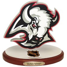
Obligatory daily Buffalo post, on the Sabres' new logo, from U.K. Dizzyhead Jane.

It does look rather strange (more tadpole than auroch), and at the same time anonymous (it has that "electrified" quality found on so many logos — I think only the NFL's Chargers can legally get away with it).
So—I don't know what I think of it yet, and I suppose it doesn't matter. One had gotten used to the "Beauty and the Beast"–style logo of the past decade...

...and yet old-timers like moi will always be attached to the original version, which is both dignified and dynamic (not as stolid, say, as that era's big leaf or the letter C). Those two white "action" lines speak volumes!


1 Comments:
Well, at least we can look forward to the 15 home games with the 'alternate' jersey--the original charging bison...
Post a Comment
<< Home